Finding the Right Words for Monitoring
In enterprise software, the wrong words can create internal friction and drive up support tickets. This project set out to standardize the terminology in a new Monitoring feature. What looked like a mere naming decision revealed itself to be an alignment between developers, admins, and product owners.
Methodology Note
- Company: Anonymized for confidentiality reasons
- Data: Two rounds of unmoderated testing with 40 participants across product roles
- Purpose: Demonstrate terminology standardization methodology
- Tools: UserTesting, Figma
- Target users: Developers, admins, and product owners
The Challenge
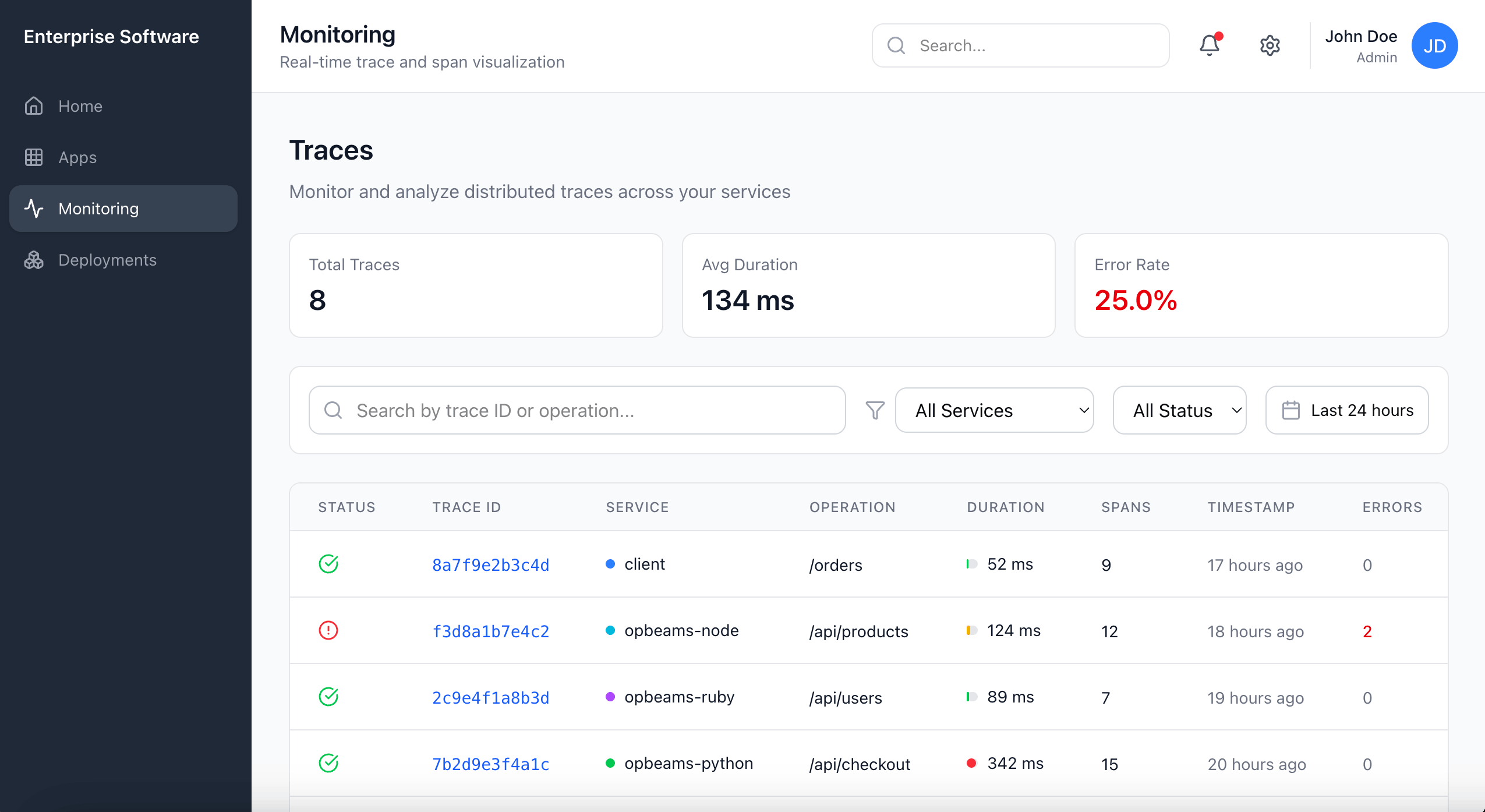
The Monitoring feature was designed to display logs and system traces. Some of these terms had roots in industry standards, others were unique to our product. None worked consistently across our users.
Developers leaned toward precision, while product owners cared more about accessible language. Admins wanted both. Even internally, teams didn't fully agree on what each term meant. This inconsistency made its way into the UI and documentation, creating friction and confusion.
I needed to find terminology that was natural, widely understood, and still accurate enough to preserve credibility with developer users.
Constraints
The feature was shipping in three weeks. The PM wanted terminology finalized but had no clear direction beyond "make it work for everyone." I partnered with a UX researcher, which gave me access to UserTesting, but we had no budget for follow-up rounds if the first tests failed. Any terminology changes also had to work across UI, docs, and support materials simultaneously.
The Approach
I ran two rounds of unmoderated testing with 40 participants across product roles. Each session followed the same pattern: free-input prompt to capture natural vocabulary, then a randomized multiple-choice set of four options, then an explanation of reasoning.
Splitting into two rounds helped control for context bias. The first round used text-only prompts; the second used UI mockups. This way, I could see whether a term felt natural in isolation but confusing in the interface, or vice versa.
Findings
The following results reflect participant preferences when shown terms in UI context, which proved most predictive of actual usage patterns.
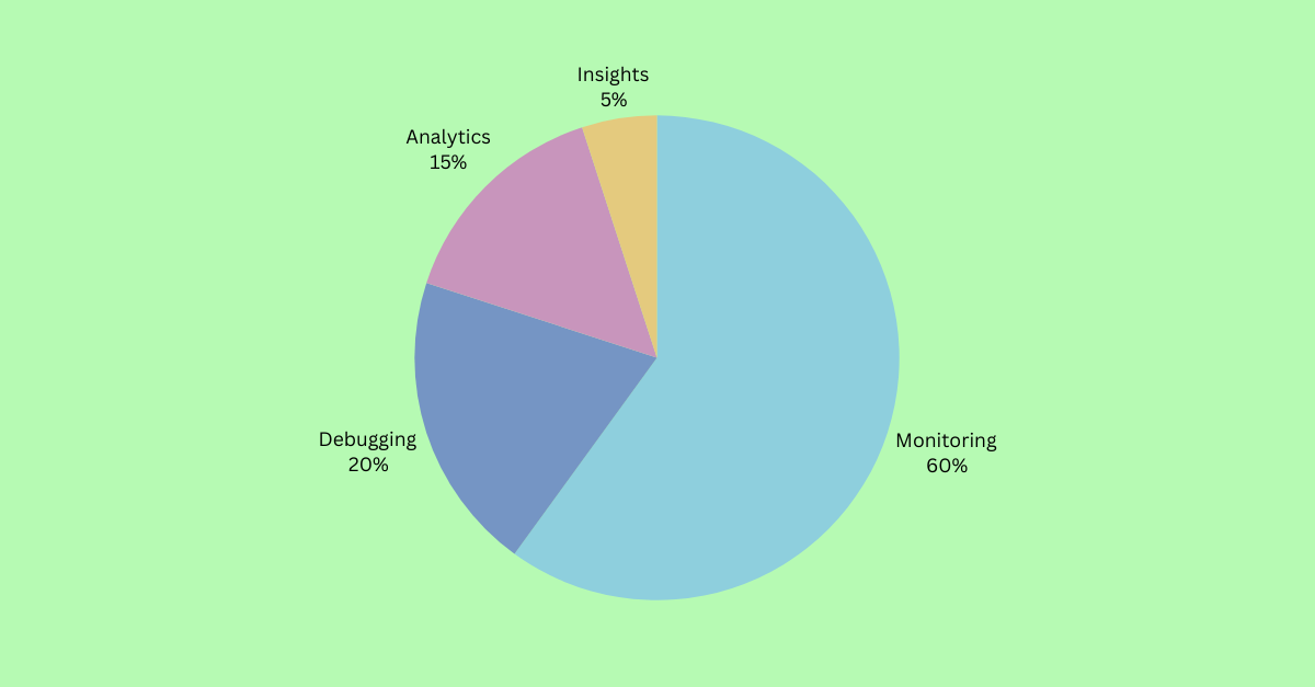
| Term Tested | Winner | Preference | Decision |
|---|---|---|---|
| Umbrella term | Monitoring | 60% (24/40) | Keep as umbrella label |
| System records | Logs | 90% (36/40) | Keep unchanged |
| System behavior | Traces | 60% (24/40) | Replace "Activities" |
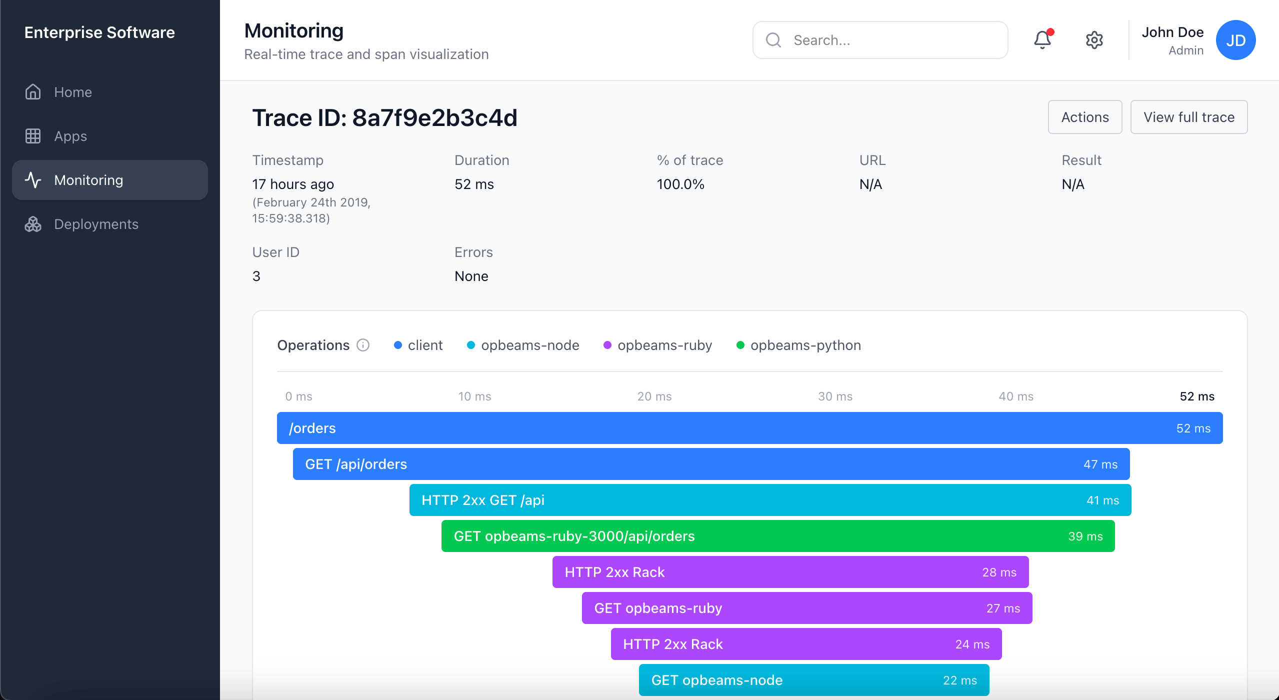
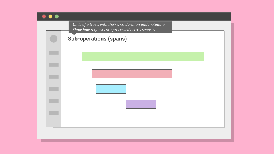
| Span | Operation | 70% chose "Operation" | Rename with tooltip |
Weighted Scoring
Raw preference wasn't enough. A term could win the vote but still cause confusion in context. To account for this, I applied a weighted scoring model:
| Factor | Weight | Rationale |
|---|---|---|
| Industry-standard term | +1.25× | Aligns with external docs, reduces onboarding friction for experienced users |
| Caused hesitation or confusion | 0.9× (−10%) | Penalizes terms that tested well but triggered follow-up questions |
This is why "Traces" beat "Events" despite similar raw scores. "Traces" carried the industry multiplier; "Events" triggered confusion about whether it meant user actions or system events.
The Hardest Call: "Traces"
The most difficult naming decision emerged around system behavior records. In observability, the industry-standard term is "trace": a record that captures how an application executes logic across services. Our UI labeled this "Activities." On paper, the word sounded approachable. In practice, it was vague. Some participants assumed it meant audit logs of end-user actions.
In text-only prompts, many leaned toward "Events," finding it intuitive and less technical. But once shown UI mockups, comprehension shifted. With context, "Traces" gained ground. By the end of the second round, 60% favored "Traces", compared with 5% for "Activities" and 35% for "Events".
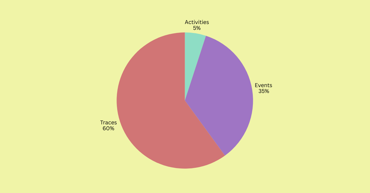
"Events" remained useful in specific contexts. Product owners found it approachable. But under the scoring model, "Traces" carried the industry-standard multiplier, which pushed it above "Events" in the final evaluation.
Decision: Retire "Activities". Use "Traces" as the canonical term, supported by UI context and documentation. Reserve "Events" for user-facing occurrences only.
View statistical validation
Chi-square tests: All four term categories showed preferences significantly different from random chance (p < 0.001 for Monitoring, Logs, and Spans; p < 0.01 for Traces).
Binomial tests: Each winning term significantly outperformed its closest competitor in head-to-head comparison (p < 0.05 for all).
Weighted scoring: Industry-standard terms received a multiplier of +1.25. Terms that caused hesitation or confusion were penalized with a 0.9 factor. This ensured final choices balanced clarity with business strategy.
Outcome
By the end of the research, the terminology set for the Monitoring feature was standardized: "Monitoring" as the umbrella label, "Logs" unchanged, "Activities" retired in favor of "Traces," and "Spans" reframed as "Operations" with tooltip support.
This consistency carried through the UI, documentation, and support, reducing ambiguity and improving usability. Developers, admins, and product owners now had a shared language.
Results
In follow-up interviews, participants described the revised terms as more natural and easier to navigate. I touched base with support management three months after the changes went live. They reported a measurable decrease in Monitoring-related tickets.
More importantly, the methodology set a precedent. By combining free input with multiple choice, text-only prompts with UI context, and validating results through statistical testing, the team gained a repeatable model for terminology research.